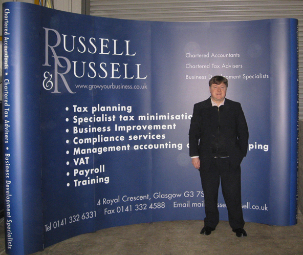
Here I am standing in front of the 4-by-3 exhibition stand I designed for Russell & Russell Accountants & Business Advisers. The 4×3 curved-wall is bigger than the usual 3×3 size of pop-up stand and makes a much bigger impact. Russell & Russell also ordered a matching wraparound graphic for the transit case and a wooden top to turn the case into a counter display. Delegates noticed the Russell & Russell stand right from the first exhibition they took part in.
Exhibition Stand Design
“Think big” is the watchword of exhibition design, and I would add “Cut down your text to the minimum”. Your exhibition stand won’t usually be seen empty like a big picture on a gallery wall, it’ll normally have your staff and prospects in front of it. You want your friendly staff to welcome prospects onto your stand, and the best way to promote that is for them to believe that THEY HAVE THE BEST STAND IN THE SHOW. That’s the effect a great stand has.
Russell & Russell are a firm of Chartered Accountants, Tax Advisers and Business Advisers who have been helping businesses in Glasgow for 37 years. They think that the way the 4×3 stands folds down into its transit case between shows – with the footprint of a big suitcase – is a definite advantage to these convenient stands. They have also praised the stand for “only taking 5 minutes to put up”.
[/dt_text_html][/dt_column][/dt_row]
